How Tessella Works
This page explains the ideas behind Tessella’s design: how a screen is put together out of widgets, the kinds of widgets you’ll encounter, and how state survives across rebuilds of the interface. It’s a good companion to the more hands-on Tutorial and the per-widget Widgets guide.
Basics
Widget tree
In Tessella, interfaces are built out of widgets: the fundamental building blocks of the screen. Each widget describes one isolated piece of the interface, whether that’s something visual (text, an image, a button) or something structural (alignment, spacing, layout).
Widgets nest inside one another, forming a tree. Every widget can have one or more children, all the way up to the root, which is the entry point of the interface:
Container(
    child=Center(
        child=Text("Hello, world!")
    )
)
Here, Container is the root and has Center as its child, which in
turn centers the Text widget inside itself. Every widget inherits from
the same base class, so any widget can act as the root: there’s no special
type reserved for that role. That makes it possible to test and compose
interfaces starting at any level of the hierarchy.
Types of widgets
Widgets fall into two categories: primitive and composite. Primitive
widgets carry their own internal logic and do one specific job, such as
drawing text, applying margins, or capturing gestures. Composite widgets
are built by combining other widgets (usually primitives) into a
higher-level component: the Button widget, for example, is assembled
from a GestureDetector, a Container and a Text.
This composition-based approach lets complex components be built out of small, reusable pieces instead of large, monolithic widgets, keeping code easier to read and maintain.
Widgets can also be classified by purpose:
Renderable: widgets visible to the user, such as text, buttons and switches.
Functional: invisible widgets with specific behavior, such as the gesture detector.
Structural: widgets used to position other elements, such as columns, rows and stacks.
State control in widgets
Reusable components are usually built as a new type based on
StatelessWidget, letting you assemble a composite component tailored to
your needs.
Consider a screen made of a container holding a row with three columns, each column pairing a line of text with a switch underneath it. All three labels share the same style, defined once and reused throughout the examples on this page:
text_style = TextStyle(font_color="#eeeeee", font_size=20)
Container(
    child=Row(
       main_axis_alignment=MainAxisAlignment.SPACE_BETWEEN,
        children=[
            Column(
                shrink_wrap=True,
                main_axis_alignment=MainAxisAlignment.CENTER,
                children=[
                    Text(
                        text="Option 1",
                        style=text_style
                    ),
                    Switch(WidgetKey())
                ]
            ),
            Column(
                shrink_wrap=True,
                main_axis_alignment=MainAxisAlignment.CENTER,
                children=[
                    Text(
                        text="Option 2",
                        style=text_style
                    ),
                    Switch(WidgetKey())
                ]
            ),
            Column(
                shrink_wrap=True,
                main_axis_alignment=MainAxisAlignment.CENTER,
                children=[
                    Text(
                        text="Option 3",
                        style=text_style
                    ),
                    Switch(WidgetKey())
                ]
            )
        ]
    )
)
The three columns are nearly identical: only the label text differs. Tessella lets you avoid this repetition by turning the repeated structure into a new, custom widget:
class LabeledSwitch(StatelessWidget):
    def __init__(self, label: str):
        super().__init__()
        self.label: str = label

    def build(self) -> Widget:
        return Column(
            shrink_wrap=True,
            main_axis_alignment=MainAxisAlignment.SPACE_BETWEEN,
            children=[
                Text(
                    text=self.label,
                    style=text_style
                ),
                Switch(WidgetKey())
            ]
        )
LabeledSwitch takes a string argument, and its build method
reproduces the structure that was repeated above, using that argument
instead of a fixed value. The repeated block can now be replaced with the
new widget:
Container(
    child=Row(
        main_axis_alignment=MainAxisAlignment.SPACE_AROUND,
        children=[
            LabeledSwitch("Option 1"),
            LabeledSwitch("Option 2"),
            LabeledSwitch("Option 3")
        ]
    )
)
If LabeledSwitch doesn’t need to be a real widget type, a plain
function works just as well and skips the class boilerplate:
def labeled_switch(label: str) -> Widget:
    return Column(
        shrink_wrap=True,
        main_axis_alignment=MainAxisAlignment.SPACE_BETWEEN,
        children=[
            Text(
                text=label,
                style=text_style
            ),
            Switch(WidgetKey())
        ]
    )
Called the same way, just as labeled_switch("Option 1") instead of
LabeledSwitch("Option 1"). Reach for a function when you’re only
avoiding repeated code and the result doesn’t need to carry its own state,
be checked with isinstance, or otherwise behave as a distinct tree
node. Reach for StatelessWidget once it does. Custom widgets can be
built out of other custom widgets, recursively, without limit.
Sometimes an interface has mutable state of its own, such as the value of
a slider or whether a switch is on. Rebuilding the widget tree normally
discards the affected widgets and creates fresh ones in their place, which
would wipe that state out. To keep it around, use stateful widgets: inherit
from StatefulWidget and WidgetState. This example adapts the
interface above to track each switch’s state correctly:
class LabeledSwitchState(WidgetState):
    def __init__(self):
        self.switch_key: WidgetKey = WidgetKey()

class LabeledSwitch(StatefulWidget[LabeledSwitchState]):
    def __init__(self, key: WidgetKey, label: str):
        super().__init__(key)
        self.label: str = label

    def create_state(self) -> LabeledSwitchState:
        return LabeledSwitchState()

    def build(self) -> Widget:
        return Column(
            shrink_wrap=True,
            main_axis_alignment=MainAxisAlignment.CENTER,
            children=[
                Text(
                    text=self.label,
                    style=TextStyle(
                        font_size=24,
                        font_color="#eeeeee",
                        anti_aliasing=True,
                    )
                ),
                Switch(self.state.switch_key)
            ]
        )
Parts of the widget tree can be discarded during interface updates,
clearing out any information stored directly on the widgets once they’re
rebuilt. Stateful widgets work around this by keeping their state in a
separate object (the “state”), which survives rebuilds and is retrieved
through a widget key. Widget keys are instances of WidgetKey, and their
job is to uniquely identify a widget.
LabeledSwitch takes a key to represent itself and implements
create_state to create a new state object on initialization. That
state object initializes and stores its own key for the Switch widget
(accessed through self.state), so the switch’s state is preserved too.
StatefulWidget takes a generic type T. It’s strongly recommended
(though not required) that this type inherit from WidgetState.
Widget keys must be created outside the build method, not inside it, so
they survive changes to the widget tree. This example shows the correct
and incorrect way to do it:
class LabeledSwitch(StatefulWidget[LabeledSwitchState]):
    def __init__(self, key: WidgetKey, label: str):
        super().__init__(key)
        self.label: str = label

    def build(self) -> Widget:
        return Column(
            shrink_wrap=True,
            main_axis_alignment=MainAxisAlignment.CENTER,
            children=[
                Text(
                    text=self.label,
                    style=TextStyle(
                        font_size=24,
                        font_color="#eeeeee",
                        anti_aliasing=True,
                    )
                ),
                # CORRECT: reference an external key
                Switch(self.state.switch_key)
            ]
        )
class LabeledSwitch(StatefulWidget[LabeledSwitchState]):
    def __init__(self, key: WidgetKey, label: str):
        super().__init__(key)
        self.label: str = label

    def build(self) -> Widget:
        return Column(
            shrink_wrap=True,
            main_axis_alignment=MainAxisAlignment.CENTER,
            children=[
                Text(
                    text=self.label,
                    style=TextStyle(
                        font_size=24,
                        font_color="#eeeeee",
                        anti_aliasing=True,
                    )
                ),
                # WRONG: instantiate a new key
                Switch(WidgetKey())
            ]
        )
build can be called many times over the life of the program.
Instantiating a key directly inside it means a new key is created on every
rebuild, which invalidates the widget’s previous state. Keys need to live
outside build so the widget can be correctly identified, and its state
preserved, across updates.
Layout system
Tessella’s layout system is declarative and tree-structured. Layout is
calculated recursively: each widget receives size constraints from its
parent, sizes itself within those constraints, and passes new constraints
down to its own children. Some widgets size themselves from the bottom up
instead; a Column, for example, sizes itself based on its children’s
combined size, so its layout can only resolve once theirs does. None of
this needs any intervention from you.
Layout happens in three phases:
Constraint propagation: widgets adjust the size limits passed down based on available space and their parent’s behavior.
Size determination: each widget works out its own dimensions from the constraints it received.
Positioning: each widget is placed at its correct location.
This recursive system is what lets complex layouts be built out of simple, composed widgets, as shown above.
Layout constraints
Layout constraints are a minimum and maximum width and height, bounding the
space a widget may expand into, plus a top-left coordinate for where the
widget should be positioned. In Tessella, these are encapsulated in an
immutable WidgetConstraints structure, handed to each widget by its
parent during the layout pass.
A widget’s calculate_size is expected to size itself using the
constraints it received, the same way every built-in widget does.
Honoring min_width, max_width and their height counterparts isn’t
enforced by the base Widget class though: it’s each widget’s own
responsibility, so a custom widget that ignores its constraints will
simply overflow instead of getting clamped. Widgets can be built to adapt
flexibly across a range of sizes, or to behave rigidly under strict limits
(a fixed width, for instance).
Constraint propagation
Constraint propagation passes information about available space down to children, top-down, starting at the root and moving toward the leaves.
Each widget transforms the constraints it receives and applies new ones to
its own children, according to its own layout semantics. A Padding
widget, for example, shrinks the available limits by its padding values,
while a Row splits the available width among its children.
The layout phase, summarized:
The parent calls
apply_layout_constraintson each child.Each child works out its size from the constraints it received.
The parent positions each child within its own available space.
This starts when calculate_layout is called on a root widget, passed
a rectangle describing the space available for the interface. The
resulting absolute positions are what rendering draws with. As with
input handling, this isn’t tied to a single root: an app driving
multiple independent widget trees calls calculate_layout separately
on each one, including on resize.
Input handling
Input handling uses a recursive event propagation model, much like layout. It takes events fired by Pygame (clicks, key presses, mouse movement) and dispatches them to the widgets in the tree.
Each input event is an immutable pygame.Event carrying context: its
type, position, the button pressed, or the key involved. New events
should be forwarded to the root of a widget tree, which propagates them
internally.
Nothing requires a single root, either. An app can maintain multiple
independent widget trees at once, say gui1 for an in-game HUD and
gui2 for a pause menu, each with its own root. Calling
process_event separately on each one propagates the event through
that tree alone; the trees don’t know about each other, so it’s up to
you to decide which roots receive a given event (and in what order, if
that matters for your app).
Widgets can respond selectively to the events they care about, and can also stop an event from being acted on more than once. This matters most in overlays and context menus made up of several interactive components.
Event propagation
Propagation happens recursively, root to leaves. At each step, the system checks whether the event is still unconsumed, based on whether some other widget has already handled it.
Each widget receives the event with its positional context and decides whether to act on it. If a widget captures an event and marks it consumed, the event still passes down to the remaining widgets, but won’t be handled again.
Widgets rendered through Overlay are a special case: they get first
look at every event, ahead of the rest of the tree, regardless of where
they actually sit structurally. This is what lets Dropdown react to a
click landing anywhere in the interface by closing its floating list, even
though the click wasn’t aimed at it. Closing the dropdown this way doesn’t
consume the event, so whatever the click actually landed on still handles
it normally afterward.
This starts when process_event is called on a root widget with a
pygame.Event, the same way gui.process_event(event) is called from
the game loop in Quickstart. Each widget passes the event, and the
updated consumed state, on to its children. If your app drives more than
one root, call process_event on each of them; every call starts its
own, independent propagation pass.
process_event returns a bool: whether the event ended up consumed
by the time propagation finished. That return value is what lets you
chain multiple roots together when order matters, for instance letting a
pause menu’s root see an event first and only forwarding it to the
gameplay root underneath if it comes back unconsumed:
consumed = pause_menu.process_event(event)
gui1.process_event(event, consumed=consumed)
Updating the UI
The interface updates continuously, in sync with the application’s main
loop, generally once per frame. During this cycle, update should be
called recursively starting at a root, letting every widget refresh its
own internal state. This is what makes time-based logic, like animations
or timers possible. TextField already relies on it to blink its
insertion cursor while focused, and any custom widget can use it the same
way.
Call each root widget’s update at the start of every main loop
iteration, right after processing input and before rendering, so state is
always current by the time the frame renders. As with process_event
and calculate_layout, this is per root: an app driving multiple
independent widget trees updates each one separately.
Subject-observer pattern
To handle communication between widgets in different parts of the tree, and with data from outside the tree entirely, Tessella implements a variation of the subject-observer pattern.
A subject object (or notifier) can be watched by multiple widgets, called listeners. Whenever the subject changes meaningfully, it notifies every registered listener, which reacts by rebuilding its own visuals.
The Listener widget lets part of the tree watch a shared value:
click_counter: ValueNotifier[int] = ValueNotifier[int](1)

gui: Widget = Center(
    Listener(
        observable=click_counter,
        builder=lambda clicks: Center(
            Text(f"Clicks: {clicks.value}")
        )
    )
)
Here, click_counter is a ValueNotifier[int]: an observable integer
that notifies its listeners on every change.
Listener watches click_counter and rebuilds its content whenever the
value changes. The builder function defines the new visual subtree to
show for the counter’s current value, which is what makes the displayed
count update dynamically.
Using Listener decouples logic from presentation: the counter can be
updated from anywhere, and the interface reacts on its own, with no
imperative instructions or direct references between widgets required.
Partial updates
Tessella’s declarative model lets the interface rebuild often without hurting performance, thanks to a rendering system built around partial updates. When a widget is marked for rebuilding (for instance, when a listener notices its observed value changed), only the affected subtree gets recalculated and redrawn. The rest of the tree stays untouched.
Consider the simplified structure of a Button widget:
GestureDetector(
    child=Container(
        width=self.width,
        height=self.height,
        child=Center(
            Text(
                text=self.text,
            )
        )
    )
)
The button is built out of a Container with an explicit width and
height, so it keeps a constant size regardless of the layout constraints
imposed on it from outside. Updates happening elsewhere in the interface
don’t affect the button’s subtree, so there’s no need to recalculate its
layout.
The same applies to updates triggered from inside the button itself: when
a state change causes it to rebuild (through invalidate_child, the
same mechanism Listener uses), only that widget’s own subtree is
rebuilt and re-measured. Since the container has a fixed size, its
position and dimensions stay unchanged no matter what happens inside it,
keeping the rest of the interface’s layout intact. This is what lets
Tessella stay fast even in highly dynamic interfaces.
Styling
Tessella’s styling system is declarative and specific to each widget type, giving fine-grained control over how visual elements look. Every stylable widget accepts an associated style object bundling together the visual attributes that matter to it: colors, margins, borders.
Separating style from structure promotes reuse, clarity and visual consistency, and lets different instances of the same widget share a single style object:
regular_text = TextStyle(
    font_color="#eeeeee",
    font_size=32,
    anti_aliasing=True
)

my_text = Text("Hello!", style=regular_text)
my_other_text = Text("World!", style=regular_text)
Both Text widgets above share the same style instance. This cuts down
on repetition and guarantees visual uniformity across parts of the
interface that serve a similar purpose. Bundling visual parameters into a
reusable object means a change, like adjusting a font color or size, can
be made in one place and apply automatically everywhere that style is
used.
This centralization matters most in larger applications, where a
consistent look and feel is important. Tessella takes it further with the
Palette class, which holds the default colors every *Style class
draws from: surfaces, borders, text and accent colors all come from it.
Re-theming the whole widget set is a matter of editing Palette rather
than tracking down every individual style class.
Full reference: Palette.
Since structure and style are entirely separate, the same widget tree can
look like a completely different interface just by swapping the style
objects fed into it. The three screenshots below are all the same
inventory panel: same grid, same slots, same items, same details panel,
same Row/Column/Container structure and spacing, with only
colors, border radii and fonts changed between them:


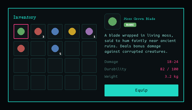
Each theme also picks a display font to match its mood: a blackletter
face, a calligraphic script, and a monospace/typewriter face respectively,
passed in through TextStyle(font_path=...) for just the title and item
name, while the body copy keeps Tessella’s bundled default font for
readability. Source for all three themes lives in
docs/styling_showcase.py.
Debug mode
For inspection and troubleshooting, every widget supports a visual debug
mode that draws an outline (or, for a few widgets, a translucent fill or
tint) marking exactly the space it occupies, instead of its normal
contents. It’s driven by the debug_mode argument on render:
gui.render(display, debug_mode=True)
Each widget type uses its own distinct, consistent color, so you can tell
at a glance which widget an outline belongs to without cross-referencing
code: Row/Column outline in green, Container in pink,
Align/Text in blue, and so on through the rest of the widget set,
including structural wrapper widgets (StatelessWidget,
StatefulWidget, Stack, SizedBox, Positioned, Listener)
that have no visuals of their own outside debug mode.
Because composite widgets (like Button or Checkbox) are built out
of other widgets, their debug outline is layered underneath the outlines of
whatever they’re built from. A Button, for instance, shows its own
StatefulWidget outline plus the GestureDetector, Container,
Center and Text outlines nested inside it. This makes the debug
view a literal picture of the widget tree rather than just the final
visual result, useful for tracking down layout issues like unexpected
padding, misalignment, or a widget silently expanding to fill more space
than intended.
One thing worth knowing: debug mode doesn’t cache its output the way normal rendering does. Outside debug mode, a widget draws its surface once and reuses it every frame until something actually invalidates it (see Partial updates above); the debug outline is redrawn from scratch on every single frame instead, whether or not anything changed. Debug mode is a troubleshooting tool, not something meant to ship, so staying simple and always current mattered more than being fast. It does mean debug mode can visibly lag on large or complex trees, though. A temporary cache that fills in while debug mode is on and gets garbage-collected the moment it’s switched off would be a welcome contribution.