Tessella

Getting Started:

  • Installation
    • Requirements
    • Installing
    • Setting up for development
    • Building this documentation
    • Next steps
  • Quickstart
    • The game loop
    • Hello, Tessella
    • A quick tour of what’s happening
    • Next steps
  • Tutorial
    • 1. Laying out a screen
    • 2. Reacting to clicks
    • 3. Reactive state with ValueNotifier and Listener
    • 4. Packaging it into a reusable widget
    • 5. Putting it in a real window
    • Where to go next
  • How Tessella Works
    • Basics
      • Widget tree
      • Types of widgets
      • State control in widgets
    • Layout system
      • Layout constraints
      • Constraint propagation
    • Input handling
      • Event propagation
    • Updating the UI
      • Subject-observer pattern
      • Partial updates
    • Styling
    • Debug mode
  • Widgets
    • Layout & structure
      • Center
      • Container
      • Row
      • Column
      • Stack
      • Positioned
      • Flexible
      • SizedBox
      • Padding
      • Align
    • Text & media
      • Text
      • TextWrap
      • Image
      • Placeholder
      • Scrollable
    • Input & interaction
      • Button
      • GestureDetector
      • Checkbox
      • Switch
      • Radio
      • Slider
      • TextField
      • Dropdown
    • Reactive & overlays
      • Listener
      • Overlay
  • Gallery
    • Complete examples
    • Styling showcase
    • Widgets
      • Layout & structure
      • Text & media
      • Input & interaction
      • Reactive & overlays

Reference:

  • API Reference
    • tessella package
      • Subpackages
        • tessella.observer package
        • tessella.overlay package
        • tessella.widgets package
      • Submodules
      • tessella.constraints module
        • WidgetConstraints
      • tessella.offset_surface module
        • OffsetSurface
Tessella
  • Gallery
  • View page source

Gallery

A visual tour of Tessella: complete screens built entirely out of widgets, followed by a look at each individual widget on its own. Every screenshot below is a real, unmodified render produced by Tessella itself.

Complete examples

These combine layout, styling, input handling and reactive state into full screens: the same kind of thing you’d end up building in a real game or app. Source for all of them lives under src/tests/cases.
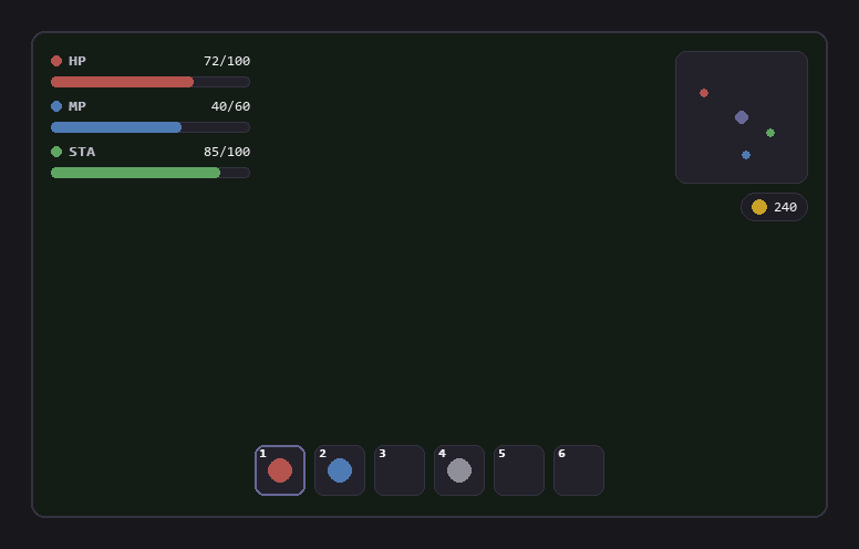
An in-game HUD overlay with health/mana/stamina bars, a minimap, a currency pill and a numbered hotbar.

HUD overlay

An inventory grid next to a details panel describing the selected item.

Inventory panel

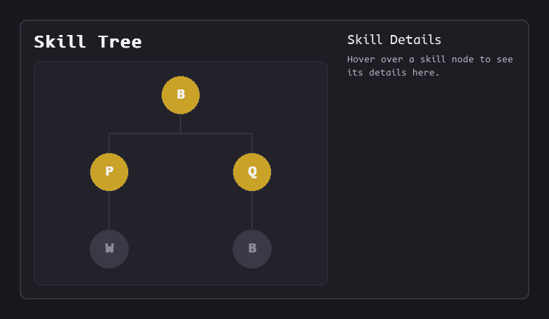
A skill tree with connected nodes and a hover-driven details panel.

Skill tree

A small desktop of draggable floating windows, each showing a live metric.

Multi-window dashboard

A dialogue box overlaid on a background image, with a portrait, speaker tag and response buttons.

Dialogue box

A retro arcade HUD with a ticking score, countdown timer and pulsing combo badge.

Arcade overlay

A login form with username and password fields, a remember-me checkbox and a submit button.

Login form

A settings panel with switches, a dropdown, a slider and a radio group.

Settings panel

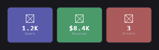
Three evenly-flexed stat cards showing users, revenue and errors.

Dashboard cards

A row of image thumbnails, one of them tagged NEW.

Media gallery

Styling showcase

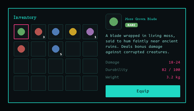
The three screenshots below are all the same inventory panel: same grid, same slots, same items, same details panel, same structure and spacing, restyled with nothing but different colors, border radii and fonts. See the “Styling” section of How Tessella Works for more on why structure and style stay this decoupled, and docs/styling_showcase.py for the source.

The inventory panel styled as a dim, torch-lit dungeon ledger, with a blackletter title and warm brown/gold colors.

Dungeon Ledger

The same inventory panel styled as a light, pastel cottage-shop ledger, with a cursive script title and cream/rose colors.

Cottage Parlor

The same inventory panel styled as a neon sci-fi terminal, with a monospace title and cyan/magenta colors on black.

Terminal Cache

Widgets

Every widget that renders something visual, shown with its default or lightly-configured styling. Purely structural widgets that have no visual of their own (StatelessWidget, StatefulWidget, Widget, …) are omitted. See the API reference for the full list of constructor arguments and styling options.

Layout & structure

A card with text centered inside it.

Center

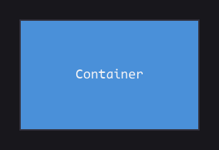
A single styled box with a label inside it.

Container

Three colored chips laid out evenly in a horizontal row.

Row

Three colored chips laid out evenly in a vertical column.

Column

Three overlapping semi-transparent squares, centered on top of each other.

Stack

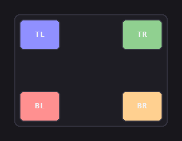
Four chips pinned to the corners of a card.

Positioned

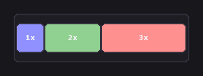
Three chips sharing a row's width in a 1:2:3 ratio.

Flexible

Three boxes separated by fixed-size spacer gaps.

SizedBox

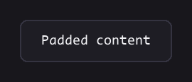
A card with text surrounded by padding.

Padding

Nine labeled chips, one at each of a card's alignment points.

Align

Text & media

A single line of text.

Text

A paragraph of text wrapped and centered inside a card.

TextWrap

The same image rendered side by side with CONTAIN and COVER fits.

Image

A dashed placeholder box.

Placeholder

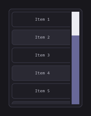
A scrollable list of numbered items inside a card.

Scrollable

Input & interaction

A single accent-colored button reading Click Me.

Button

A round hover/click target.

GestureDetector

Two labeled checkboxes, one checked.

Checkbox

Two labeled toggle switches.

Switch

Three labeled radio buttons in a group.

Radio

A horizontal and a vertical slider.

Slider

Two text input fields, one showing hint text.

TextField

A closed dropdown showing its first option.

Dropdown

Reactive & overlays

A counter label above an Increment button.

Listener

A button that toggles a floating overlay.

Overlay

Previous Next

© Copyright 2026, cuaitz.

Built with Sphinx using a theme provided by Read the Docs.