Tutorial
This tutorial builds a small click-counter app, introducing Tessella’s layout widgets, styling, input handling, reactive state and custom widgets along the way. It assumes you’ve already followed the Quickstart.
1. Laying out a screen
Tessella’s layout widgets compose the same way Flutter’s do: a widget either
holds a single child (Container,
Center,
Padding, …) or a list of children
(Row, Column).
Let’s lay out a styled box with some padded text inside it:
gui: Widget = Center(
    Container(
        width=220,
        height=80,
        style=ContainerStyle(
            color="#232136",
            border_style=BorderStyle(
                color="#9090ff",
                thickness=2,
                border_radius=BorderRadius.all(12)
            )
        ),
        child=Center(
            Text("Clicks: 0", style=TextStyle(font_color="#eeeeee", font_size=24))
        )
    )
)

A few things to note:
Containercombines a box (size +ContainerStyle) with an optional child. Leavingwidth/heightasNonemakes it hug its child (or expand to fill the available space if it has none).ContainerStyleandBorderStyledescribe how something looks; widgets describe structure. This separation is used throughout Tessella (ButtonStyle,TextStyle,CheckboxStyle, …).Row/Columnacceptmain_axis_alignment(spacing along the main axis) andcross_axis_alignment(alignment across it). SeeMainAxisAlignmentandCrossAxisAlignment.
2. Reacting to clicks
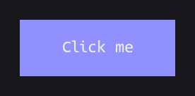
GestureDetector wraps any widget
and reports clicks, hovers and drags through callbacks:
Container(
    width=220,
    height=80,
    style=ContainerStyle(color="#9090ff"),
    child=GestureDetector(
        on_click=lambda: print("Clicked!"),
        child=Center(Text("Click me")),
    )
)
Button is a ready-made combination of a
GestureDetector, a Container and a Text, styled through a single
ButtonStyle:
Button(
    key=WidgetKey(),
    text="Click me",
    width=220,
    height=50,
    on_click=lambda: print("Clicked!"),
    style=ButtonStyle(
        container_style=ContainerStyle(color="#9090ff"),
        text_style=TextStyle(font_color="#eeeeee", font_size=22),
    )
)

Every stateful widget (Button included) takes a WidgetKey. Tessella
uses it to look up the widget’s persisted state between rebuilds. More on
that in the next section.
3. Reactive state with ValueNotifier and Listener
So far our widgets are static: rebuilding the tree is the only way to change
what’s on screen, which is wasteful for something as simple as a counter.
ValueNotifier wraps a value and
notifies listeners whenever it changes;
Listener rebuilds just its subtree in
response:
clicks: ValueNotifier[int] = ValueNotifier(0)

gui: Widget = Center(
    Column(
        shrink_wrap=True,
        children=[
            Listener(
                observable=clicks,
                builder=lambda notifier: Text(f"Clicks: {notifier.value}")
            ),
            Button(
                key=WidgetKey(),
                text="+1",
                width=100,
                height=40,
                on_click=lambda: setattr(clicks, "value", clicks.value + 1),
            )
        ]
    )
)
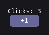
This is what it looks like right after the window opens:

Every time clicks.value is reassigned, Listener calls builder
again and swaps in the freshly built widget. Only the Text gets
rebuilt, not the Button or the Column around it. Three clicks on
+1 later, without touching anything else in the tree:
4. Packaging it into a reusable widget
Once a piece of UI has its own moving parts, it’s worth extracting it into a
StatefulWidget. Its state
persists across rebuilds via a WidgetState looked up by the widget’s
WidgetKey:
class CounterState(WidgetState):
    def __init__(self):
        self.clicks: ValueNotifier[int] = ValueNotifier(0)

class Counter(StatefulWidget[CounterState]):
    def __init__(self, key: WidgetKey):
        super().__init__(key)

    def create_state(self) -> CounterState:
        return CounterState()

    def build(self) -> Widget:
        return Column(
            shrink_wrap=True,
            main_axis_alignment=MainAxisAlignment.CENTER,
            children=[
                Listener(
                    observable=self.state.clicks,
                    builder=lambda notifier: Text(f"Clicks: {notifier.value}")
                ),
                Button(
                    key=WidgetKey(),
                    text="+1",
                    width=100,
                    height=40,
                    on_click=lambda: setattr(
                        self.state.clicks, "value", self.state.clicks.value + 1
                    ),
                )
            ]
        )

gui: Widget = Center(Counter(key=WidgetKey()))
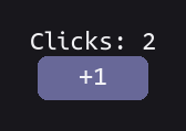
Same behavior, now packaged behind a single, reusable Counter(key=...)
call. Here it is after two clicks on a fresh instance:
If a widget doesn’t need to hold on to any state, prefer
StatelessWidget instead. It
only requires overriding build.
5. Putting it in a real window
Drop gui from any of the snippets above into the game loop from the
Quickstart and you have a complete, interactive app. Here it is with
the Counter widget from the previous section, as a single, self-contained
script you can copy, paste and run as-is:
import pygame
from tessella import *

class CounterState(WidgetState):
    def __init__(self):
        self.clicks: ValueNotifier[int] = ValueNotifier(0)

class Counter(StatefulWidget[CounterState]):
    def __init__(self, key: WidgetKey):
        super().__init__(key)

    def create_state(self) -> CounterState:
        return CounterState()

    def build(self) -> Widget:
        return Column(
            shrink_wrap=True,
            main_axis_alignment=MainAxisAlignment.CENTER,
            children=[
                Listener(
                    observable=self.state.clicks,
                    builder=lambda notifier: Text(f"Clicks: {notifier.value}")
                ),
                Button(
                    key=WidgetKey(),
                    text="+1",
                    width=100,
                    height=40,
                    on_click=lambda: setattr(
                        self.state.clicks, "value", self.state.clicks.value + 1
                    ),
                )
            ]
        )

pygame.init()
display = pygame.display.set_mode((300, 200), pygame.RESIZABLE)
clock = pygame.time.Clock()

gui: Widget = Center(Counter(key=WidgetKey()))
gui.calculate_layout(display.get_rect())

running = True
while running:
    delta_time = clock.tick(60)

    for event in pygame.event.get():
        if event.type == pygame.QUIT:
            running = False
        elif event.type == pygame.WINDOWRESIZED:
            gui.calculate_layout(display.get_rect())

        # consumed is True if the UI acted on this event (e.g. a button
        # click). Not used here since this example has no game logic of
        # its own, but you'd check it to decide whether an unconsumed
        # event should also be handled as gameplay input, e.g. a click
        # the UI ignored being treated as aiming or firing a weapon.
        consumed = gui.process_event(event)

    gui.update(delta_time)

    display.fill(Palette.BACKGROUND)
    gui.render(display)
    pygame.display.update()

pygame.quit()
Running it opens a resizable 300x200 window with the counter centered
on it, ready to click:

Where to go next
Browse the API reference for the full widget catalog
(Row, Stack, Positioned, Dropdown, Slider, Switch,
Checkbox, Radio, Scrollable, Image, TextWrap, …) and
their styling counterparts under tessella.widgets.style.