Widgets
A practical, task-oriented look at every widget in Tessella: what it’s for and a minimal example of using it. This is deliberately lighter on detail than the API reference. Each entry below links to its full parameter list there, and to a screenshot in the Gallery.
All snippets below assume from tessella import *, as in the
Quickstart.
Layout & structure: Center, Container, Row, Column, Stack, Positioned, Flexible, SizedBox, Padding, Align
Text & media: Text, TextWrap, Image, Placeholder, Scrollable
Input & interaction: Button, GestureDetector, Checkbox, Switch, Radio, Slider, TextField, Dropdown
Reactive & overlays: Listener, Overlay
Layout & structure
Center
Centers a single child within all the space its parent gives it. It’s the widget you reach for by default any time something just needs to sit in the middle of its container.
Center(
    Text("Hello, Tessella!", style=TextStyle(font_size=32))
)
Full reference: Center.
Container

Shown here with a border added purely so its bounds are visible.
A bare Container has no color and no border by default, so on
its own it’s exactly as invisible as an unsized SizedBox.
The general-purpose box: an optional fixed width/height, a
background/border via ContainerStyle, and one optional child. Leave
width/height as None to hug the child’s size instead. Note
that a Container with no child and no size will silently expand to
fill whatever space it’s given, which is a common source of “why is my box
huge” surprises.
Container(
    width=220,
    height=80,
    style=ContainerStyle(
        color="#9090ff",
        border_style=BorderStyle(
            color="#5050aa", thickness=2, border_radius=BorderRadius.all(12)
        )
    ),
    child=Center(Text("Clicks: 0"))
)
Full reference: Container.
Row
Lays its children out left to right. Use main_axis_alignment to
control spacing along the row and cross_axis_alignment to control
vertical alignment. Pass shrink_wrap=True to make the row only as
wide as its children instead of filling all available width (ignored if
any child is a Flexible).
Row(
    main_axis_alignment=MainAxisAlignment.SPACE_EVENLY,
    children=[chip_one, chip_two, chip_three]
)
Full reference: Row.
Column
The vertical counterpart to Row: same main_axis_alignment,
cross_axis_alignment and shrink_wrap semantics, just top to
bottom instead of left to right.
Column(
    shrink_wrap=True,
    cross_axis_alignment=CrossAxisAlignment.START,
    children=[Text("Username"), text_field, Text("Password"), password_field]
)
Full reference: Column.
Stack
Draws its children on top of one another, first at the bottom. Combine
with Positioned children to place them precisely, or leave children
unpositioned and use alignment to anchor all of them at the same
point (e.g. concentric circles). Set clip_behavior=ClipBehavior.CLIP
to cut off anything that overflows the stack’s bounds.
Stack(
    children=[
        background_image,
        Positioned(left=0, bottom=0, child=dialogue_panel),
    ]
)
Full reference: Stack.
Positioned
Pins a child to specific edges of its parent (typically a Stack),
instead of letting the parent lay it out normally. Give it exactly one of
left/right and exactly one of top/bottom: passing both
sides on the same axis raises an error.
Stack(
    children=[
        Positioned(left=10, top=10, child=top_left_badge),
        Positioned(right=10, bottom=10, child=bottom_right_badge),
    ]
)
Full reference: Positioned.
Flexible
Makes a child share the remaining main-axis space of a Row or
Column proportionally to its flex_factor, similar to CSS’
flex-grow. It only has an effect inside a Row/Column: using
it anywhere else is a no-op.
Row(
    children=[
        Flexible(flex_factor=1, child=sidebar),
        Flexible(flex_factor=3, child=main_content),
    ]
)
Full reference: Flexible.
SizedBox
Forces an exact size onto a child, or, used without a child, acts
as a fixed-size invisible spacer. The idiomatic way to put a gap between
two widgets in a Row/Column is a SizedBox with only one axis
set (the other defaults to 0).
Row(
    children=[
        icon,
        SizedBox(width=8, height=0),  # 8px horizontal gap, no height
        Text("Settings"),
    ]
)
Full reference: SizedBox.
Padding
Surrounds a single child with empty space described by an EdgeInsets,
growing to fit the child plus that padding.
Padding(
    padding=EdgeInsets.symmetric(horizontal=30, vertical=20),
    child=Text("Padded content")
)
Full reference: Padding.
Align
Positions a child at one of nine anchor points (PositionalAlignment)
within all the space available, without resizing the child. Fun fact:
Center is just Align pinned to PositionalAlignment.CENTER.
Align(
    alignment=PositionalAlignment.BOTTOM_RIGHT,
    child=Text("v1.0", style=SMALL_STYLE)
)
Full reference: Align.
Text & media
Text

Draws a single line of styled text. It sizes itself to exactly fit the string and does not wrap. For multi-line text that adapts to available width, use TextWrap instead.
Text("Hello, Tessella!", style=TextStyle(font_size=32, font_color="#eeeeee"))
Full reference: Text.
TextWrap

Like Text, but breaks the string across as many lines as needed to fit
the width available to it. The widget to reach for with paragraphs,
descriptions or anything whose length you don’t control. word_split
controls whether lines break on word boundaries (default) or mid-word,
and TextWrapStyle.text_align controls how the lines are aligned
against each other.
TextWrap(
    text="A blade wrapped in living moss, said to hum faintly near ancient ruins.",
    style=TextWrapStyle(text_style=SMALL_STYLE, line_spacing=5, text_align=TextAlign.CENTER)
)
Full reference: TextWrap.
Image
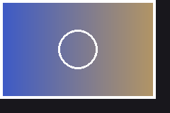
Displays a pygame.Surface (already loaded via pygame.image.load
or drawn procedurally), optionally scaling it to a given size according
to fit: CONTAIN shrinks it to fit entirely inside the bounds,
COVER scales it up to fully cover the bounds (cropping any overflow),
and STRETCH ignores the aspect ratio entirely.
portrait: pygame.Surface = pygame.image.load("assets/elder_maren.png")

Image(image=portrait, width=64, height=64, fit=ImageFit.COVER)
Full reference: Image.
Placeholder

A widget with no real content, just a dashed box with an X through it, meant for blocking out a layout before the real widgets exist yet. Useful while sketching a screen’s structure.
Placeholder(width=220, height=140, box_thickness=3)
Full reference: Placeholder.
Scrollable
Wraps a child that’s taller than the space available (typically a
shrink_wrap=True Column) and makes it scroll vertically, clipping
it to the viewport and showing a scrollbar automatically when needed.
Responds to both the mouse wheel and dragging the scrollbar thumb.
Container(
    width=240,
    height=320,
    child=Scrollable(
        child=Column(shrink_wrap=True, children=list_items)
    )
)
Full reference: Scrollable.
Input & interaction
Button
A ready-made GestureDetector + Container + Text combo: the
widget to reach for any time you just need a clickable, labeled button
without wiring up the pieces yourself. Customize its look with a single
ButtonStyle.
Button(
    key=WidgetKey(),
    text="Log In",
    width=220,
    height=50,
    on_click=lambda: print("Logged in!")
)
Full reference: Button.
GestureDetector
The low-level building block behind Button, Checkbox and friends: wraps any child and reports clicks, hover and drag/click-outside through callbacks, without imposing any visuals of its own. Reach for this directly when you need custom interactive visuals that don’t fit any of the ready-made input widgets.
GestureDetector(
    on_click=lambda: print("Clicked!"),
    on_hover_start=lambda: print("Hover start"),
    on_hover_end=lambda: print("Hover end"),
    child=Container(width=180, height=180, style=CARD_STYLE)
)
Full reference: GestureDetector.
Checkbox

A togglable square box. Give it initial_value to start it checked,
and on_changed to react to the new boolean value whenever it’s
clicked.
Checkbox(
    key=WidgetKey(),
    initial_value=True,
    on_changed=lambda checked: print(f"Subscribed: {checked}")
)
Full reference: Checkbox.
Switch

A togglable pill-shaped switch, functionally identical to Checkbox
(same on_changed callback shape), just styled like an on/off toggle
instead of a checkbox.
Switch(
    key=WidgetKey(),
    on_changed=lambda enabled: print(f"Wi-Fi: {enabled}")
)
Full reference: Switch.
Radio

Together with other Radio widgets that share the same
group_value, lets a user pick a single value out of a group. Every
Radio in the group must be given the same ValueNotifier
instance; selecting one automatically deselects the others.
size: ValueNotifier[str] = ValueNotifier("medium")

Row(
    children=[
        Radio(key=WidgetKey(), value="small", group_value=size),
        Radio(key=WidgetKey(), value="medium", group_value=size),
        Radio(key=WidgetKey(), value="large", group_value=size),
    ]
)
Full reference: Radio.
Slider

Lets the user drag a thumb along a track to pick a value between
min_value and max_value. Works both SliderOrientation.HORIZONTAL
(the default) and .VERTICAL. Set snap=False for continuous
values instead of snapping to whole numbers.
Slider(
    key=WidgetKey(),
    min_value=0,
    max_value=100,
    initial_value=40,
    on_changed=lambda value: print(f"Volume: {value}")
)
Full reference: Slider.
TextField

A single-line, clickable-to-focus text input with full keyboard editing
support (selection, word-jumping, copy/cut/paste). Its text lives in a
TextEditingController: create one to read the current value, set it
programmatically, or share it between widgets. Omit it and TextField
creates its own.
name_controller = TextEditingController()

TextField(
    key=WidgetKey(),
    controller=name_controller,
    hint_text="Enter your name...",
    on_submit=lambda value: print(f"Submitted: {value!r}")
)
Full reference: TextField.
Dropdown

A closed box showing the selected option that expands into a floating
list of DropdownItem entries when clicked. Each item pairs an
internal value with the label shown to the user.
Dropdown(
    key=WidgetKey(),
    items=[
        DropdownItem("small", "Small"),
        DropdownItem("medium", "Medium"),
        DropdownItem("large", "Large"),
    ]
)
Full reference: Dropdown.
Reactive & overlays
Listener
Rebuilds just its own subtree whenever an Observable (most often a
ValueNotifier) it watches changes, instead of rebuilding the whole
widget tree by hand. This is the main way to wire reactive state into a
UI in Tessella. See the Tutorial for the full click-counter
walkthrough.
clicks: ValueNotifier[int] = ValueNotifier(0)

Listener(
    observable=clicks,
    builder=lambda notifier: Text(f"Clicks: {notifier.value}")
)
Full reference: Listener.
Overlay
Renders a child on its own layer, above the rest of the widget tree,
regardless of where it sits in the tree structurally. Toggle it on/off
via active. This is the primitive Dropdown itself is built on top
of. Reach for it directly for custom floating UI like tooltips, popups
or context menus.
popup = Overlay(
    child=Container(
        width=240, height=90, style=CARD_STYLE,
        child=Center(Text("I'm an Overlay widget!"))
    )
)
popup.active = False  # toggle to show/hide
Full reference: Overlay.